Rise
Return to Previous Page

Project Type
Identity Design
Project Brief
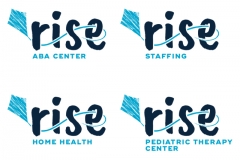
Rebrand an established pediatric therapy services agency to a new name. Move toward a more modern, clean look that is still pediatric-focused. The main parent company extends several sub-brands, so allow for a way to discern these separate, yet related, arms. Final icon of a kite represents the client's aim to help each of their patients reach new heights. The hand-drawn font is approachable and whimsical.
Project Portfolio


